
Product Box Designer — Overview
Where you find it
Go to Design in the main menu and select Product Box Designer
How the builder works
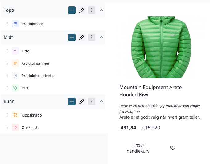
A product box is built up of two levels: sections and blocks
- A section is a horizontal row on the card. You can stack multiple sections on top of each other. Each section has its own background, inner padding, alignment, and spacing.
- A block is a single content element within a section — for example, an image, a title, a price, or a button.
The default layout has three sections: Top, Middle, and Bottom. You can rename them, change their order, add new ones, or delete them.
Adding sections and blocks
To add a new section, click Section in the sidebar. To add a block to a specific section, click Add New Block on the relevant section.
Blocks can be dragged to change their order within a section. You can also drag a block from one section to another.
Configuring sections and blocks
Click the settings icon on a section or block to open the settings in the sidebar. Changes appear in the preview immediately — you don't need to save to see the result.
The preview
The preview on the right shows four real products from your catalog, rendered with the current settings. The changes you make are displayed in real-time.
If you prefer to work with sample data instead of real products, you can switch to dummy data mode. This is useful if your products have inconsistent data that makes it difficult to evaluate the design.
Global settings
Click Theme settings in the sidebar to open settings that apply to the entire card, not just a single section or block.
Setting | What it does |
|---|---|
Background color | The card's overall background |
Padding | Distance between content and card edges |
Corner radius | Rounds the card's corners |
Frame | Adds an outline around the card |
Shadow | Adds a shadow behind the card |
Content alignment | Default text alignment for the entire card |
Hover effect | Animation that plays when the customer hovers the mouse over the card |
Hover background color | Background color that activates on hover |
Hover shadow | Shadow that activates on hover |
Animation duration | How fast hover animations play (e.g., 300ms) |
Show customer club discount label | Shows a label on products with customer club discount |
Show customer club bundle discount label | Shows a label on products with bundle discount for club members |
Available hover effects: None, Color Overlay, Zoom, Image Zoom, Lift, Tilt, Glow, Flow, Sheen, Outline, Lively, Pulse
Templates
You can save multiple configurations as named templates and switch between them. This is useful if you want different card designs — for example, a compact card for regular category lists and a more feature-rich layout for selected products.
To create a template, open the template menu at the top of the builder and select Create New Template. Give it a name, and a URL-friendly slug will be generated automatically.
When you switch to another template, unsaved changes in the current template will be lost. A confirmation dialog will warn you before this happens.
Saving
Click Save and Publish when you are satisfied with the design. Until you save, changes are only shown in the preview — nothing changes in the store.