
Header: Header Icons
Header icons
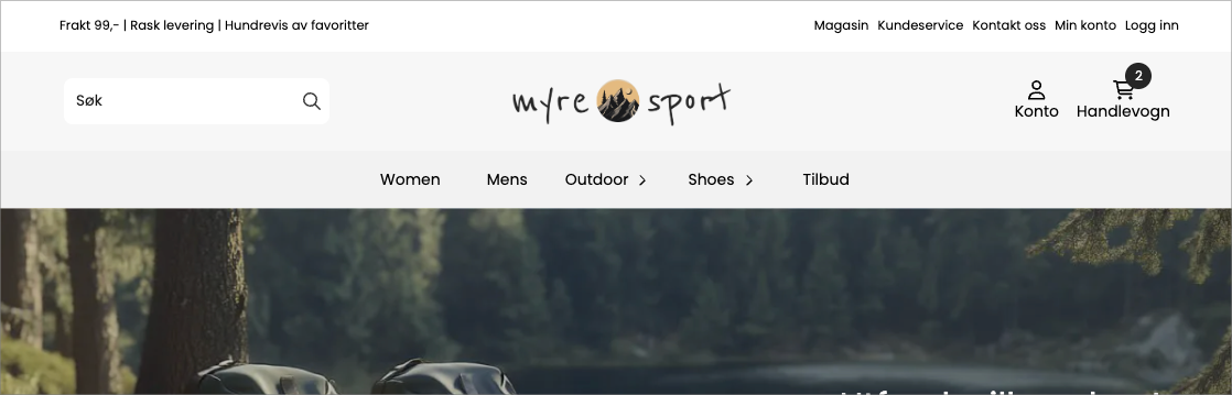
The Header Icons block contains the row of action icons in the header — cart, search, account, wishlist, language, currency, and more. You choose which icons are displayed, in what order, how each one looks, and whether a small label appears next to or below it.
This is a busy block because it brings together many separate icons in one place. The good news: each icon has the same set of settings, so once you've set up one, the rest follow the same pattern.
What it shows
A compact row of icons, usually on the right side of the header. Each icon is a shortcut: the cart opens the cart, the account icon goes to login or 'my account', the search icon opens the search bar, and so on. Some icons also show a badge (like the number of items in the cart).
Available icons
You can turn each of these on or off independently:
Icon | What it does |
|---|---|
Cart | Opens the cart |
Search | Opens the search bar |
Account | Goes to login / my account, and can show login status |
Wishlist | Opens the customer's saved / favorite products |
Main menu | An icon that opens the menu |
Newsletter | Opens newsletter signup |
Currency | Allows the customer to change currency |
Language | Allows the customer to change language |
Country | Allows the customer to change country |
VAT. | Toggles between prices with or without VAT. |
Customer club | Shows membership status for the customer club |
Settings each icon shares
For each icon you enable, you can set:
Setting | What it controls |
|---|---|
Show | Whether the icon is displayed at all |
Order | Its position in the row relative to the other icons |
Icon | Which symbol represents it (choose from the icon set) |
Icon color | The color of the icon |
Text | An optional label displayed with the icon |
Text color | The color of the label |
Text placement
The switch Show text below icon and the dropdown menu Text placement determine whether the labels appear next to the icon or below it. Use labels when the icon alone might be unclear (for example, to spell out «Account»).
Special cases worth knowing about
Some icons have extra behavior:
- Account — turn on Show login status to display different text depending on whether the customer is logged in (you set the text for logged in and logged out yourself).
- VAT — set custom labels for «VAT included» and «VAT excluded», and optionally display an automatic VAT popup.
- Customer Club — set different icon colors and labels for members versus non-members, so the icon reflects whether the customer has joined.
- Search — the search icon can open an embedded search field directly in the header. You control the field's background, text color, border, corner radius, button colors, and where it appears (top and right position).
Styling of the entire row
Setting | What it controls |
|---|---|
Badge color | The background of the quantity badge (e.g., number in cart) |
Text color on badge | The number inside the badge |
Icon size | The size of all icons in the row |
Text size | The size of the icon labels |
Icon padding | Space around each icon |
Icon background | A background fill behind the icons |
Default icon color | A default color for icons that don't have their own |
Corner radius / global radius | Rounds the icon backgrounds |
Tips
- Use Order-number on each icon to arrange the row exactly as you want — lower numbers come first.
- Do not enable all icons. An overcrowded icon row is harder to use than three–four well-chosen shortcuts.
- The search icon's built-in field is the fastest search option for most stores. If you prefer a permanent search box, use the Search Field block instead.
- The VAT, currency, language, and country icons only make sense if the store actually offers these options. Hide those you don't use.